
Back
Case Study: HealthEquity Account Card Lock
2025
TL;DR
Impact
Problem
For all of the innovations on the HealthEquity platform, one of the most-requested new features was the ability to lock or "freeze" your physical account card if it was suspected lost or stolen, if you were traveling or just wanted to control spending.
Competitive Analysis
We studied how other bank systems or apps were implementing similar features. Some examples:

Solutions
In presenting designs to stakeholders, it became clear that the best approach would be the one that more closely mapped traditional banking, with a "lock card" button and a confirmation dialog making sure that the user would be aware of what would follow. Early testing with wireframes bore this out, so the only matter was to begin mapping some of the many edge cases we would encounter.
Screen Flow: Default Path (mobile)

Screen Flow: User Card Not Activated (mobile)

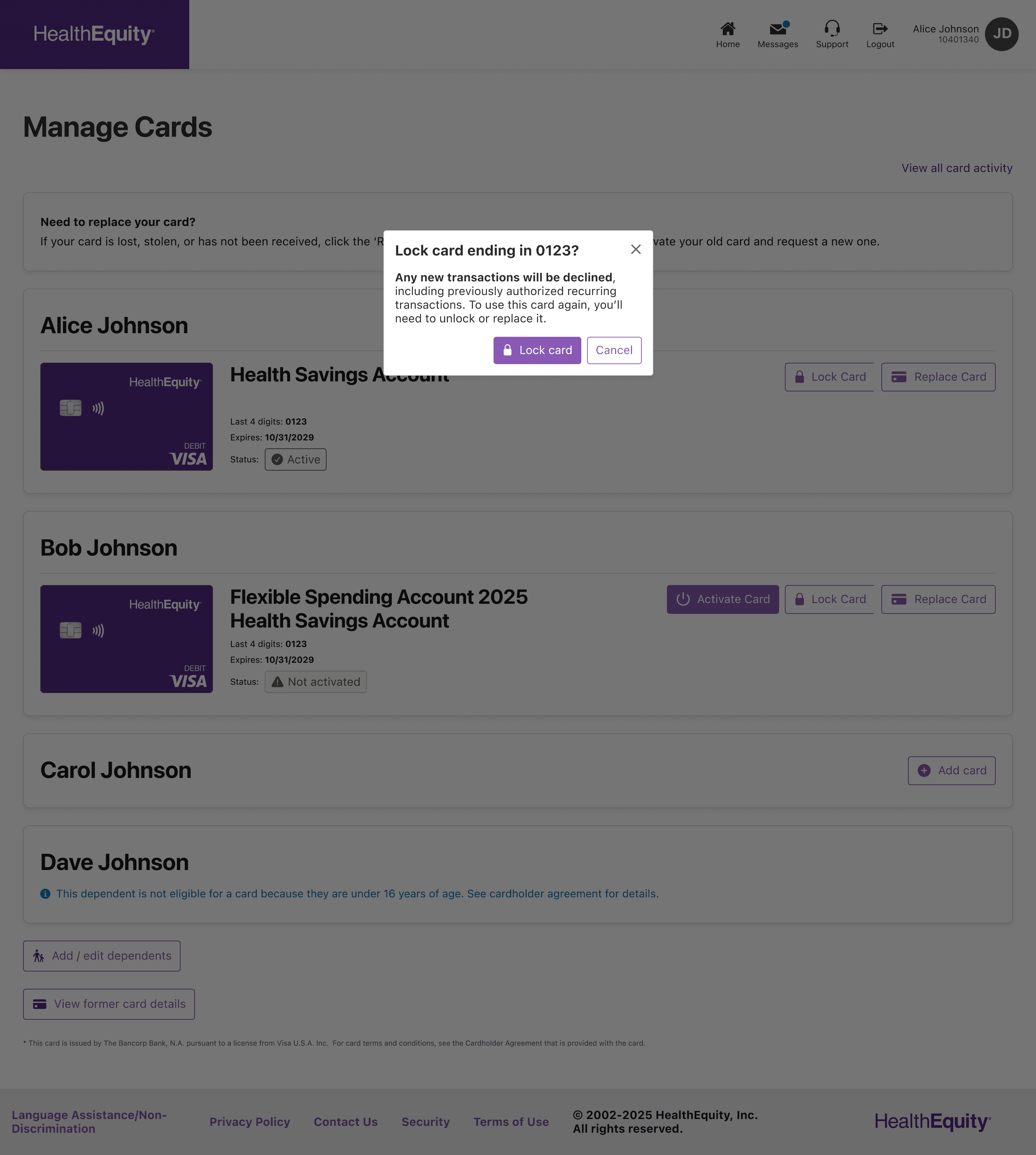
Selected Final Mockups (Desktop)

Selected Final Mockups (iOS)


Lessons Learned
Although this project seemed small from the outset, there were a couple of hurdles to get over:
1.
Have a plan for the edge cases
For what seemed like a straightforward lock-and-unlock user flow, there turned out to be a surprising number of edge cases that I needed to account for. Anything from an invalid card, card service failure, unactivated card, and plenty more added up to where the Product Owner and I worked on a new system of organizing my Figma files so that she could more easily find which cases she was after.
2.
Make room for the important stuff
Luckily we caught this issue early on and could plan for it, otherwise it might have ended up a roadmap disaster. Since this particular feature update touched card operations and finance, it required approvals from the card issuer, and then from Compliance and Legal on our side. Each of these round trips could easily add another week or two to the timeline.