
Case Study: HealthEquity Investments
2019
TL;DR
Impact
Context and Problem Analysis
HealthEquity is a health-benefits company that manages health savings accounts (HSAs), flexible spending accounts (FSAs), and other types of reimbursement accounts. Investment accounts were added later, allowing members to invest their HSA funds over a certain threshold, and clients and members alike were eager to start investing. The rollout was announced via email campaigns and notices on members' account dashboards.
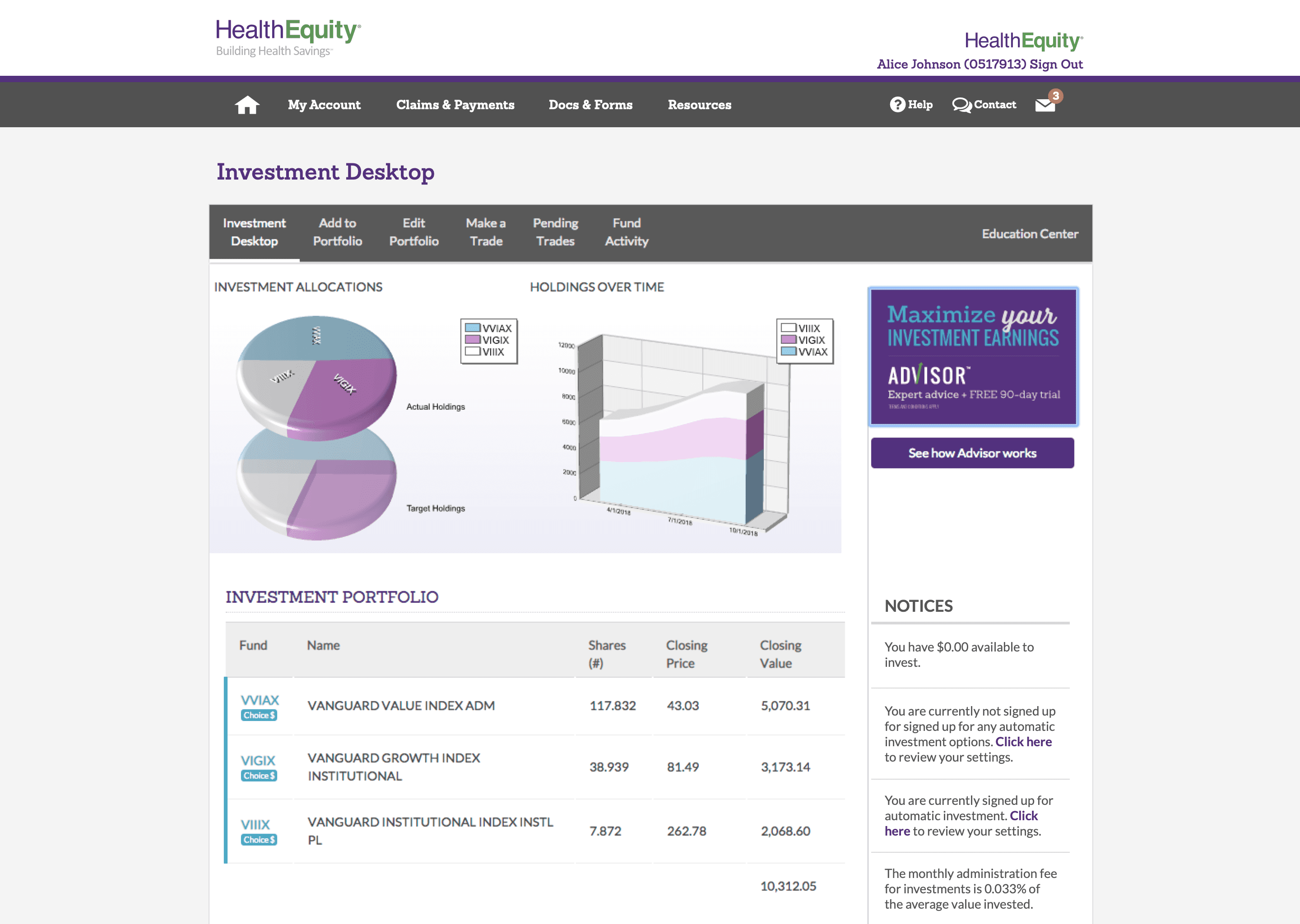
The investment dashboard pre-redesign
Research and Insights
Reaching out for the assistance of several other customer-facing groups in the company, we launched surveys to solicit targeted feedback at multiple points during onboarding, conducted user and client interviews, and even sent out email questionnaires after completion just to catch those who may have wanted to leave the process, but powered through anyway.
We uncovered several key insights:
Members are investment beginners
Overwhelmingly, our members turned out to have little-to-no prior investment experience
Most clicked out of curiosity
Most users were already logged in to their account dashboard for another purpose, those who clicked on the investment banner simply wanted to learn more
Onboarding was intimidating
Of those who clicked, most only attempted one or two pages, greeted by lengthy terms of service and tables of dense financial data among unfamiliar terms
Opportunities
I theorized that the best way to drive an increase in onboarding completion would be to simplify the entire onboarding experience, focusing on members who are far more likely to have no prior experience with investing. This could include:
Put the value proposition up front
Use less jargon-heavy terms, emphasize that members can grow their savings account by investing excess funds
Move the more technical details off-page
Allow members to explore more information via progressive disclosure in modals, accordions, education pages, etc.
Streamline the entire process
Create a version that members can complete in ten minutes or less
Move the terms and conditions to the end
When the T&C were shown first, we made them pause and make a choice (whether to accept) before they knew what their options were
Ideation and Exploration
My first few design sessions were spent on paper and whiteboards in heavy collaboration with product managers and subject matter experts from the investments teams. This proved valuable in framing possible solutions for both beginner and expert investors.
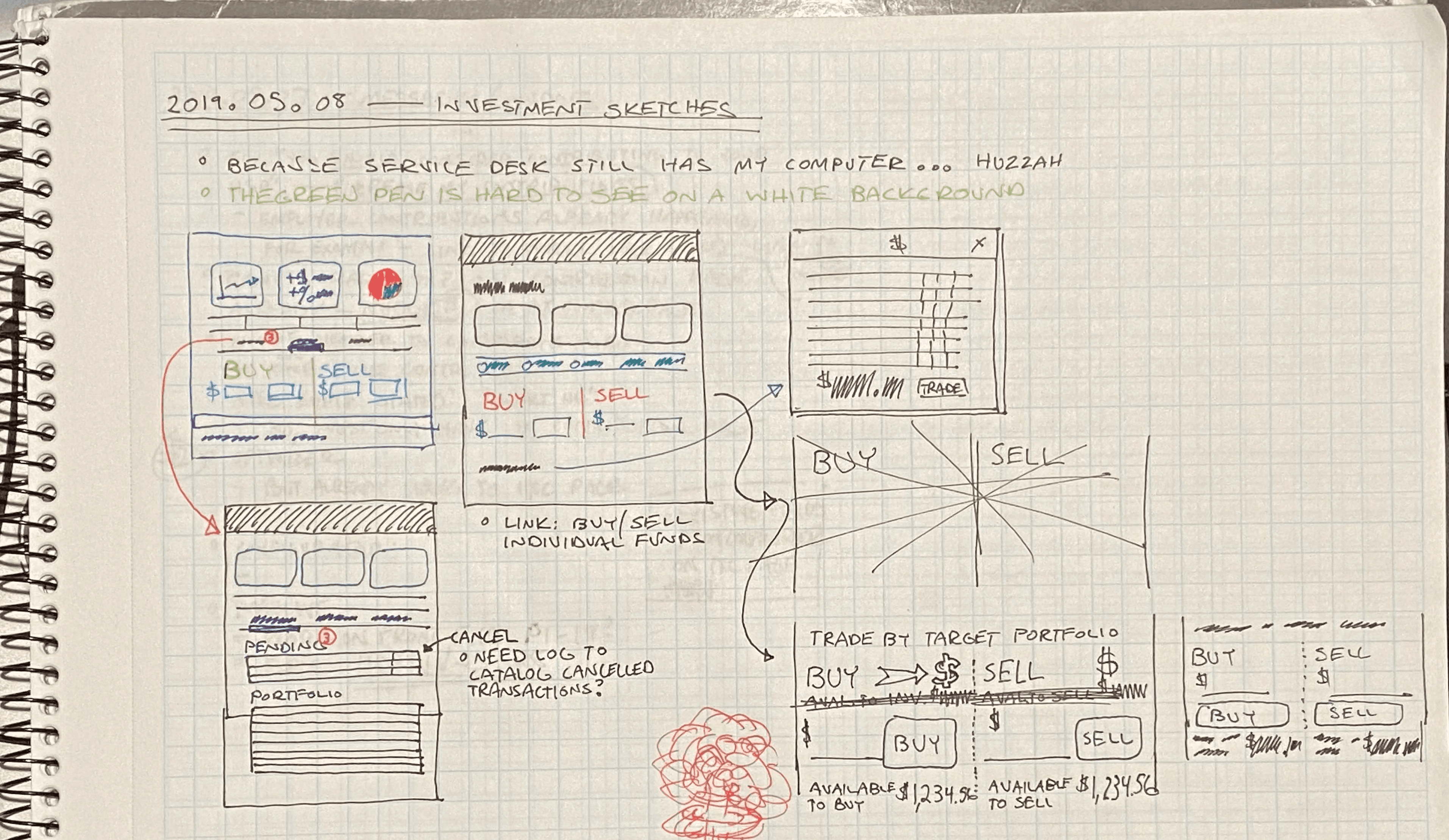
Some early notepad sketches exploring content strategy
Early testing showed positive responses, with some additional room to streamline the language. We contacted one of our biggest clients who happened to have offices close by and arranged for a series of testing sessions to make some direct observations and get on-the-spot feedback. After another couple of rounds of design working closely with internal stakeholders, we came to a much more straightforward design that accommodated both inexperienced and expert investors alike.
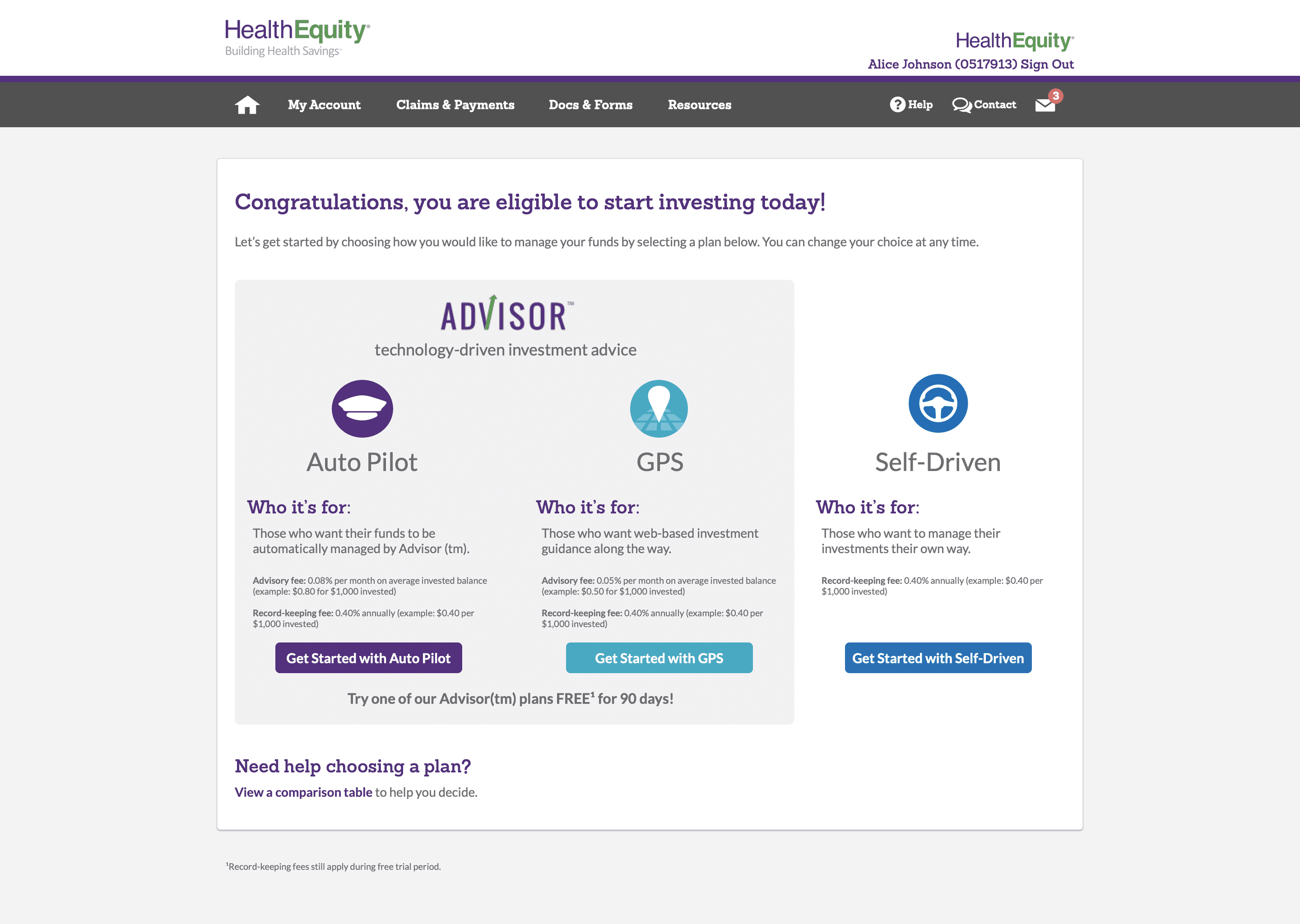
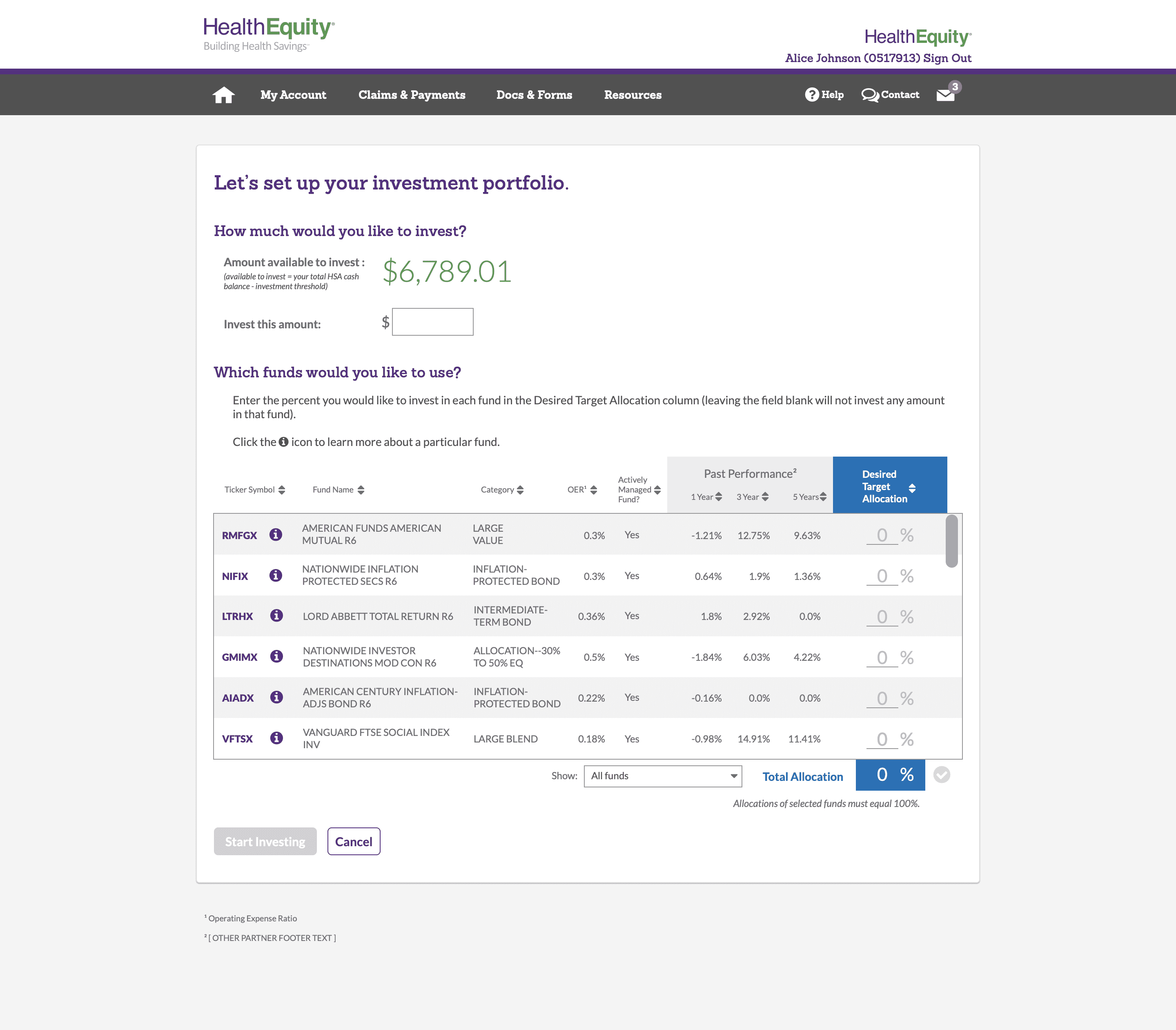
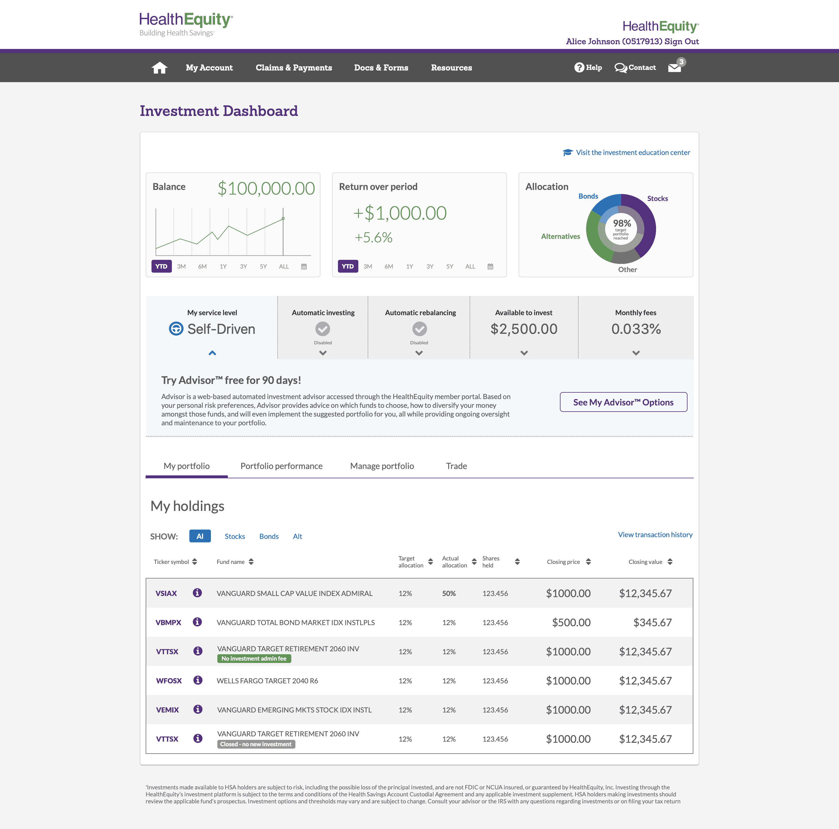
The updated plan selection, fund setup, and dashboard screens
Lessons Learned
The biggest challenge by far with this project was trying to align the most straightforward language possible with specific language requirements from our Compliance and Legal departments. Their responsibility was of course to make sure that we followed our SEC regulations, and so any UX language had to fall within those guidelines. The end result spoke for itself with a huge increase in completion rate and a vastly decreased average completion time.
Some key takeaways:
1.
Collaboration is key
Working with stakeholders across many departments was essential to making the new onboarding process a success. Without the help of internal investment, compliance, legal, and customer experience experts, we couldn't have delivered the end result that we did.
2.
Test *everyone*
Testing with participants from all across the spectrum of investing experience was critical to find a solution to meed the needs of both.