Case Study: HEALTHEQUITY Mobile App
2019
TL;DR
Impact
Context
HealthEquity is a health-benefits company that manages health savings accounts (HSAs), flexible spending accounts (FSAs), and other types of reimbursement accounts.
The mobile app redesign was an internally-driven project, prompted by a scheduled change of the app's full tech stack, a move to both modernize development and enhance security. Heads of Product, UX, and Engineering all agreed that it would also give us a perfect opportunity to update the app's design, starting with a critical examination of the mobile experience from the ground up, identifying key opportunities for improvement.
Research and Insights
Cross-collaboration was absolutely vital to the process. Early on, we brought in as many people as we could with unique insights on how the members use the mobile app, including:
We conducted workshops together and built a series of user journey maps to explore variations on the information architecture and language directive, then aligned on personas to align goals under their particular usage patterns and outlook.
Personas
Spender
Saver
Investor
Insights
Most members want to interact with the app *as little as possible*
A typical interaction will see the member open the app, check a balance or upload a receipt, then close the app
Over 90% of logins are members just checking their account balance
The #1 highest frequency interaction on the app is just members making sure they can cover a medical or pharmacy expense
After balance, members needed to complete one of three tasks:
1) Pay a healthcare provider, 2) request reimbursement for an out-of-pocket expense, or 3) upload a photo of a receipt
Opportunities
With those insights in mind, we concluded that our main task was therefore to remove as much friction as possible (without compromising security) for the member to accomplish their goals.
This could be done by:
Reworking information architecture to prioritize the top 5 user jobs to be done
Clarifying navigation to make it easier to locate information
Reducing number of pages, streamlining content
Unifying design under a clear, singular design system
Ideation and Exploration
Most of our team's journeys begin at the whiteboard. Over several days I mapped and re-mapped the architecture of the app, soliciting feedback and testing with people from across the company to help solidify the app's user journeys.
I put several sketches on paper or in Sketch to address the key insights head on. We wanted to put the members' account balance information immediately in view on opening the app, and then show the members a menu of quick actions to accomplish the other high-frequency tasks.
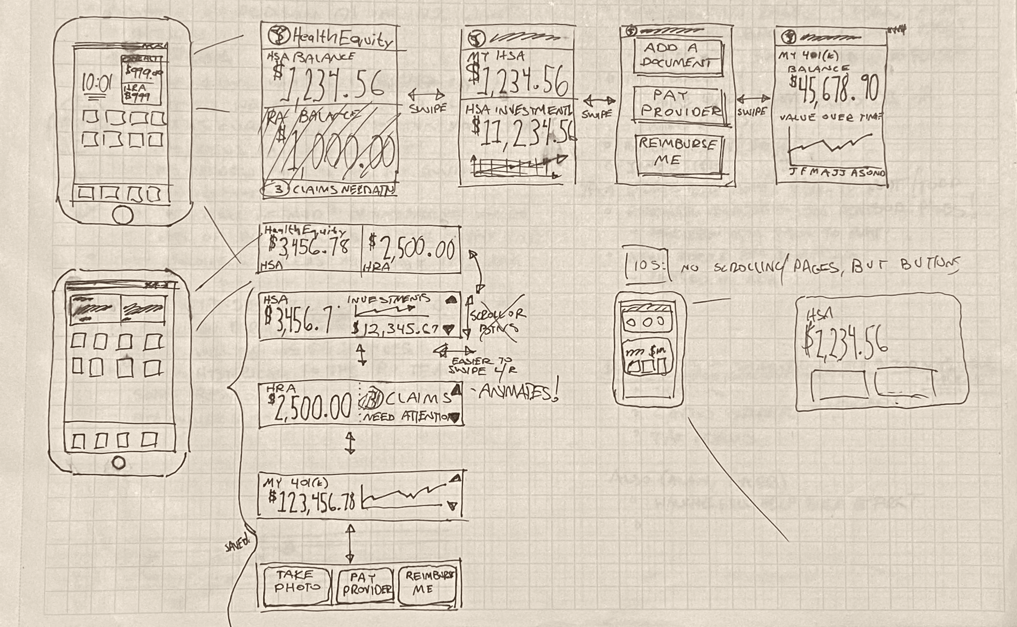
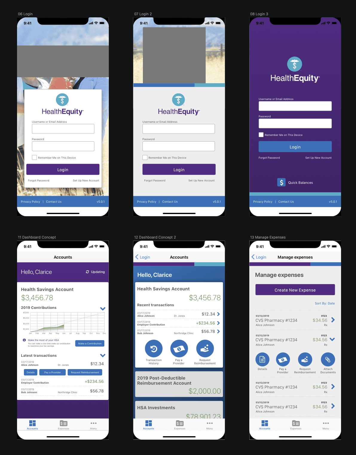
Some early notepad and digital sketches exploring content strategy
I built prototypes from the design sketches and tested them with a variety of users across different age groups, comfort levels using mobile devices, and familiarity with HSAs to make sure that we had a better, more representative cross-section of our user base. This test helped us make important adjustments to the user flow.
After several weeks of cross-collaborative iterations, a final design was built in Sketch and presented for buy-in from stakeholders.
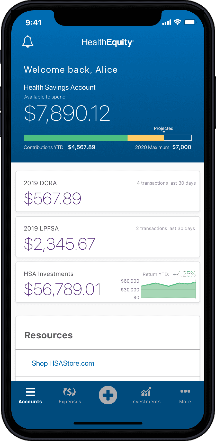
The updated dashboard with balances and main functions front and center
Lessons Learned
1.
Know your users inside and out
Any extra time taken to research, empathize, and learn about our members paid off, and it showed in our app ratings over the next several weeks as it jumped from 1.7 to 4.8 stars.
2.
Move with the bumps, plan for things to go wrong
Members and stakeholders were happy with the outcome, though the journey wasn't without hiccups. Adopting the new tech stack meant a learning curve as we adjusted to its strengths and weaknesses, and the design had to rapidly adapt to avoid derailing the launch date.
Dealing with a platform with all the complexities of healthcare and finance meant that we would have to be flexible enough to adjust to unforseen edge cases. Prioritizing these became a critical part of each sprint.